Not your typical noir palette
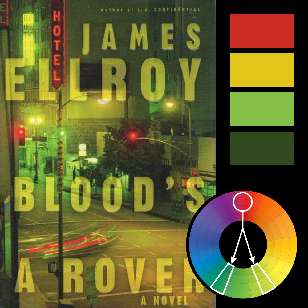
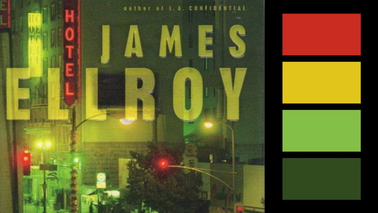
Artwork: Blood’s a Rover Book Cover by Chip Kidd
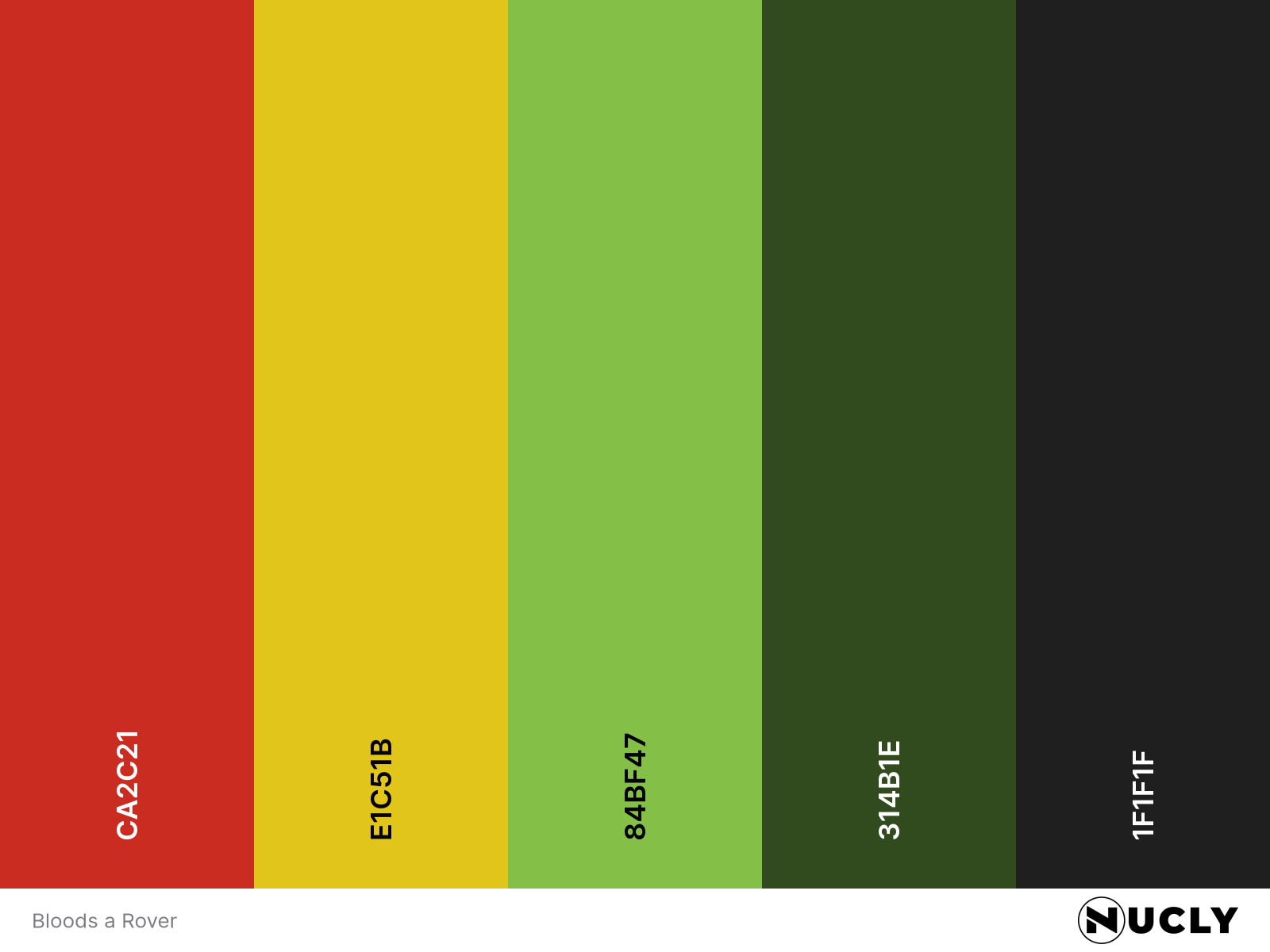
Color Harmony: Split Complementary
Key Color: Red
Link to Palette: Colors on coolors.co
This week we’re breaking new ground—our first featured book cover design. And who better to lead that charge than Chip Kidd, arguably the most recognizable name in contemporary cover design. For Blood’s a Rover by James Ellroy, Kidd used a fluorescent street photo by Jeanne Hilary and applied a surreal split complementary harmony.
Red acts as the anchor, showing up in pops of neon and taillights. It’s balanced by a cool green and lime yellow—colors that are far from the usual deep blues and purples we associate with nighttime. But that’s what makes it so striking. The entire image is drenched in unnatural green light, giving the street scene a sense of mystery, urgency, and a distinctly urban edge.
This palette does what great storytelling does—breaks the rules just enough to make you look twice.