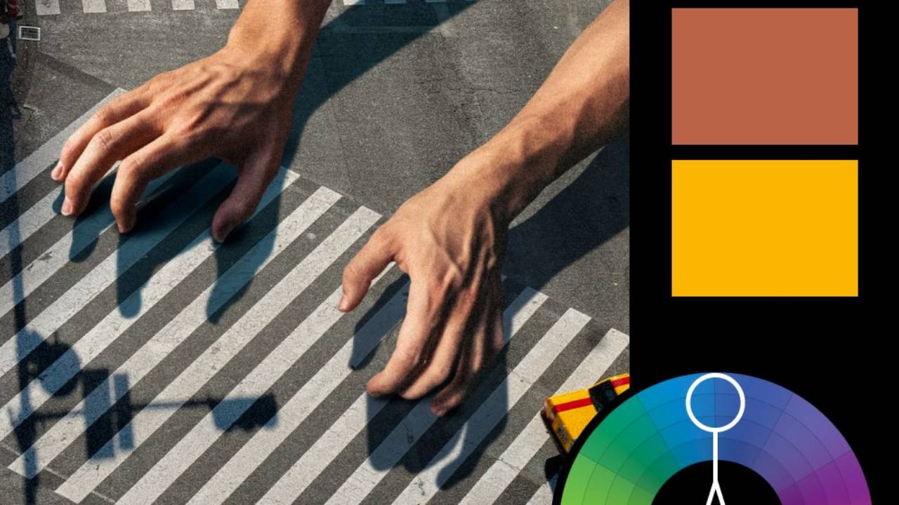
A (Split) Complementary Romance

Artwork: We Live in Time Movie Poster by Intermission Film
Color Harmony: Split Complementary
Key Color: Yellow-Orange (Skin)
Link to Palette: Colors on coolors.co
This week’s featured poster is from We Live in Time by Intermission Film, which uses a sophisticated split complementary harmony. Yellow-orange, represented by the warm skin tones of the characters, serves as the key color. It's nicely contrasted by the cooler teal and purple-blue hues, creating a palette that feels balanced yet emotionally evocative.
This harmony mirrors the film’s simplistic yet poignant narrative: man meets woman, they fall in love, and together they experience life’s highs and lows. The split complementary approach, more nuanced than a direct complement, gives the story a sense of freshness and depth. It brings to mind the quote: “The really original artist does not try to find a substitute for boy meets girl, but creates the illusion that no boy ever met a girl before.” The colors here create that same illusion, making the familiar feel both new and timeless.