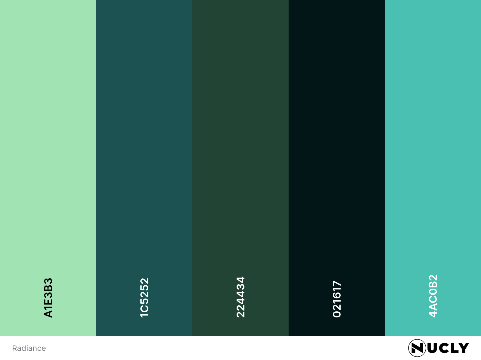
Radiance and the Power of Luminance in Color

Artwork: Radiance by Ben J on Art Station
Color Harmony: Analogous
Key Color: Pale Blue-Green
Link to Palette: Colors on coolors.co
This week’s artwork, Radiance by Ben J, showcases how light and shadow can be just as powerful as color. The palette is a restrained analogous harmony, with pale blue-green as the key color, complemented by subtle shifts into yellow-green and cyan-blue. The result is an image that feels atmospheric and ethereal without relying on strong contrast in hue.
Despite the limited color range, the piece avoids feeling monotone due to its clever use of luminance. The glowing spectral figure draws the eye, standing out against the deep shadows of the forest. The desaturated greens and blues blend seamlessly, reinforcing the quiet mystery of the scene. It’s a great example of how a carefully controlled color harmony can heighten mood and storytelling, proving that sometimes, less is more.