A Battle of Contrasts
color analysis color harmony concept art split complementary
Artwork: Guild Wars Concept Art by Daniel Dociu
Color Harmony: Split Complementary
Key Color: Desaturated Teal
Link to Palette: Colors on coolors.co
This artwork is a great example of how detail can serve the whole rather than stand out on its own. Up close, the textures and forms might seem chaotic, but together they create a striking, cohesive composition.
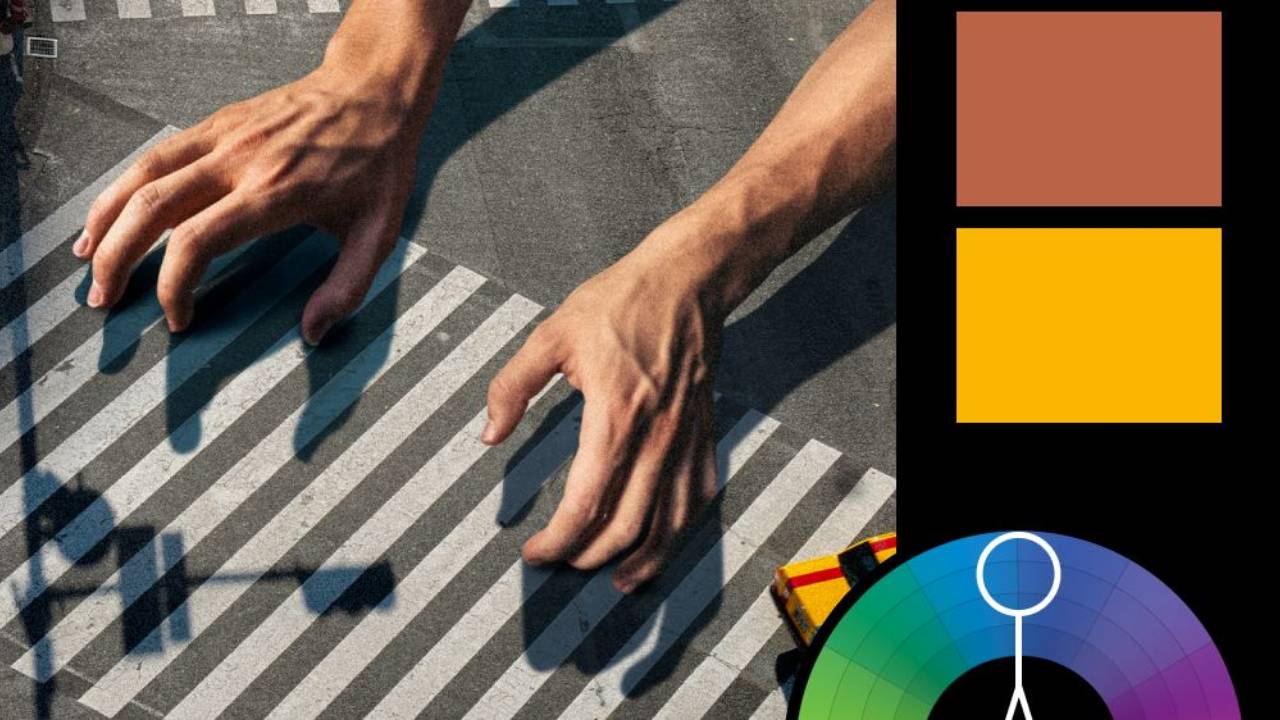
The color harmony follows a split complementary scheme, with a desaturated teal as the dominant color, accented by warm yellow and red. The teal establishes a grounded, almost industrial mood, while the warmer tones punctuate the scene with energy and contrast. The balance between muted and vibrant hues adds to the intensity, making the image feel dynamic without overwhelming the viewer.
Are you subscribed to Nucly's YouTube channel?
It's the fastest way to find out about new tutorials.
Categories
All Categories 3d lettering actions adjustment brush adjustment presets ai analogous animal hybrid animation backdrops beginner blend if blending bloom effect blur book cover brushes camera raw cartoon chromatic abberation cloth color analysis color balance color depth color grading color harmony color match color range complementary complimentary composite See More concept art content aware fill cropping curves custom brushes depth maps depth of feld difference blending mode disney dispersion effect distort effect drop shadow duotones engraving eye droppers eyes fabric face swap film grain filters firefly focal depth frame tool frequency separation gear generate image generative fill getting started series gif glass filter glow box gradient gradients grunge guide layout halftone halloween hard mix hue saturation illustration illustrator kinds of kindness knockout lasso layer styles lighting effects lightsaber effect liquify luts mask masking move tool movie poster noise noise gradient oil paint optics overlays painting palettes pattern pattern fill photography photoshop 2023 photoshop 2024 photoshop tricks photoshop updates pop art puppet warp quick mask quick selection tool realistic snow remove glare from glasses retouching rgb curve rikard rockwell rotation rule of thirds script selection brush selections shadows skin retouching smart objects split complementary split water effect spooky step and repeat textures tips and tricks tools tree filter triadic color harmony tutorials user interface video tutorial vignette watercolor wicked youtube
Join the new ALL-ACCESS Nucly Photoshop Academy
With our brand-new Nucly Academy, you get access to all of my professional training, my full library of Photoshop addons, presets and tools. And, most important, you get access to our exclusive community that includes challenges, zoom meetups, chats, Q&As and more. Explore now!


