One Mickey, Two Mickey… Seventeen Mickeys
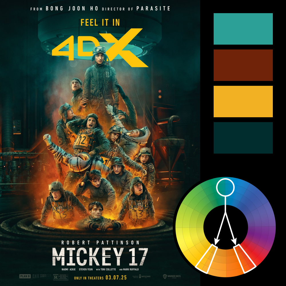
Artwork: Mickey 17 Movie Poster by AV Squad
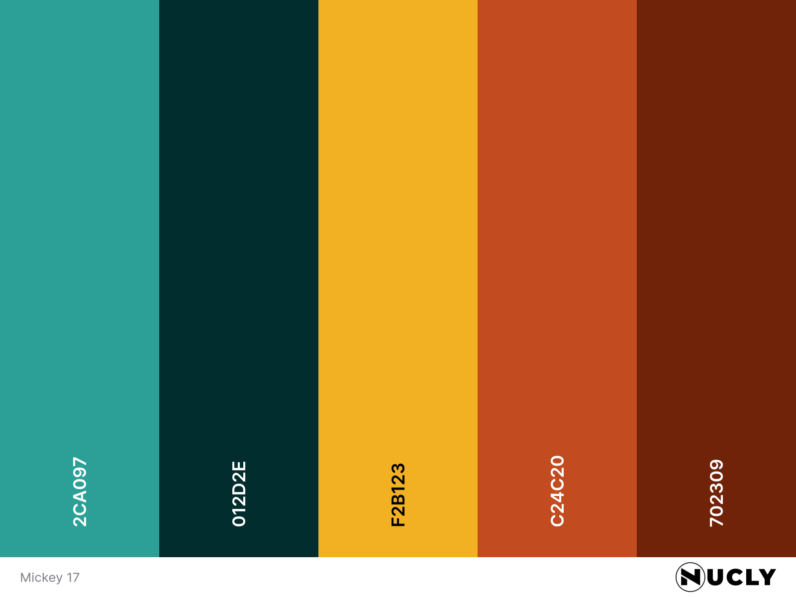
Color Harmony: Split Complementary
Key Color: Dark Cyan Teal
Link to Palette: Colors on coolors.co
This week’s poster is from Mickey 17, a film that has had more than one striking poster, but this one stands out for its seamless Photoshop work. Featuring 16 identical Mickeys stacked in a chaotic yet controlled composition, it showcases an impressive use of lighting, depth, and, of course, color harmony.
The color scheme follows a split complementary harmony, with dark cyan teal as the key color, contrasted by warm yellow and red-orange accents. The teal provides a cold, industrial feel, while the fiery oranges and yellows bring intensity, reinforcing the tension and high-stakes atmosphere of the film. It’s a great example of how split complementary colors can create a sense of balance while keeping visual interest high.
Like the poster, the color palette itself plays with repetition and contrast, stacking elements in a way that feels both methodical and chaotic—a fitting visual metaphor for a film about clones.