How a Bunch of Grapes Became a Surreal Escape

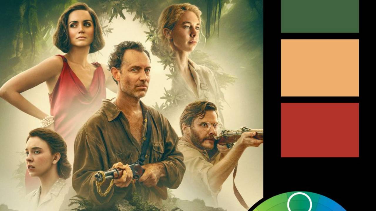
Artwork: Grape Escape from upcoming course
Color Harmony: Triadic
Key Color: Red
Link to Palette: Colors on coolors.co
This week’s image is straight from my upcoming course—Grape Escape. The composition follows a triadic color scheme, with red as the dominant color, balanced by desaturated blue and a soft, light yellow. The result is a striking yet harmonious contrast that enhances the dreamlike quality of the scene.
What makes this image even more fun is that it started with a photo of my daughter taken in my living room and a bunch of grapes from Trader Joe’s. The transformation from simple elements into a surreal escape is a testament to the power of Photoshop and creative color use. The triadic harmony helps keep the composition bold yet balanced, guiding the viewer’s eye through the whimsical scene without overwhelming it. And the use of red in the landscape gives the background a surreal look, adding to the whimsy of the scene.
This approach to color can be a great way to make an image feel vibrant and dynamic while maintaining a sense of cohesion. Want to try it yourself? The full breakdown is in the course!