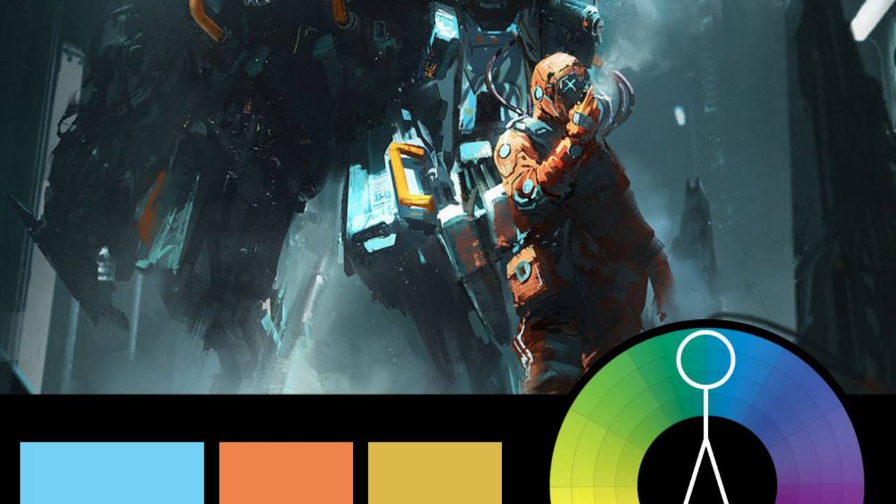
Harnessing Red with a Triadic Twist

Artwork: Red Knight by Dominik Mayer
Color Harmony: Triadic
Key Color: Red
Link to Palette: Colors on coolors.co
This week’s featured artwork is Red Knight by Dominik Mayer, which uses a powerful triadic color harmony. Red takes center stage, setting a fierce, dramatic tone, while pale yellow and pale blue are used sparingly as complementary accents. This minimal use of yellow and blue helps maintain the intensity of the red without detracting from its dominance.
The effect is striking and bold, amplifying the sense of power and determination in the knight’s figure. This is a great example of how triadic harmony can create visual impact by allowing one color to dominate while using the others to subtly enhance depth and complexity.